Over the last month or so, I've been polishing my web-based protein viewer jolecule to make it a usable thing. So I've been hard at work to get user accounts in – you can now upload your own structures if you have a Google account.
But more importantly, I've busted my gut in the last week to give the site a make-over. It now looks like a real Web 2.0 application. That's important cause people don't care how it works, but how it looks. Check out the changes in a structure page:
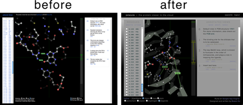
It's got gradients!
It's got branding.
It's got a sexy monochromatic color scheme.
It uses helvetica, but with kerning!
Given these design elements of the black of the molecule display, the gradients, and monochromatic color scheme, I managed to pull it all together to give the front-page a radical facelift. The front-page design is a pastiche of a design elements from various web 2.0 web-apps:
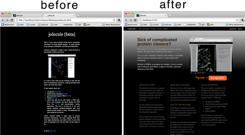
There's a nice big headline with a screenshot (soon to be replaced with a screencast).
Did I already say it has gradients?
There's big copy with an appropriate amount of buzzwords.
Amateur hour is so over.
comments powered by Disqus