Rainbow color spectrum in 2dplots considered useless
What is it with these rainbow colorings in 2d intensity plots. Here's an example of using some of my data where the intensity goes from 0 to a positive number:

The rainbow color is confusing. Is it some kind of gay pride thing? I can't see from the graph whether the yellow or the red is the "hottest" color. The intermediary colors require guesswork. I need to constantly look at the bar to get my bearings.
If you're color blind then some of the colors will be invisible.
And finally, it translates very poorly to black and white, and I know some of you out there print .pdf's on black-and-white printers because that's all your stingy department can afford.

Look how the highest values and the lowest values gets converted to black.
Instead, I've found that a two-tone color scheme is much more effective (and easier on the eye). By choosing white as one of the tones, the intensity corresponding to 0 fades into the background, allowing the vibrant red to jump into the foreground and catch the eye.

The great advantage of this choice is that the graph reproduces the information content perfectly even when reduced to black-and-white.

And given the large swathes of white, it saves ink too.
Here's another example of plotting color on to a molecular structure to convey information. First is the default rainbow color scheme used in most programs:
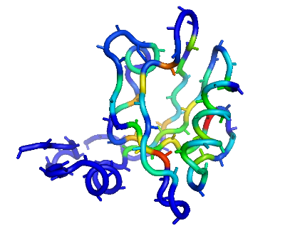
I guess the advantage with a rainbow coloring scheme is useful if you want to discuss specific intensities ("Look at the medium strength positions corresponding to that sparkling orange") but can you tell where the color corresponding to the highest value is? Is it the yellow or the red? No. I didn't think so.
Now contrast that to the red color scheme where it's dead obvious that the dark red is the most intense:

If eye-sore and poor information retrieval is not a problem, then go ahead, stick with the default rainbow coloring scheme.